
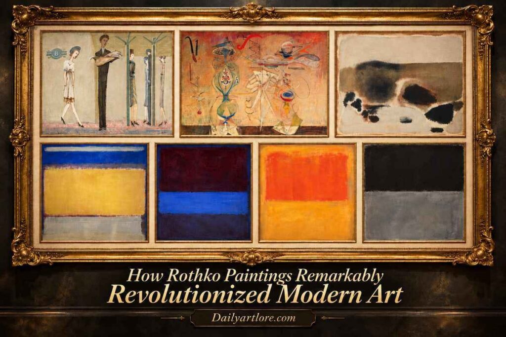

Imagine walking into the museum and seeing a massive canvas with only barely distinguishable squares of red, orange, and yellow. It is devoid of any recognizable person, place or object. There is something about those colors that gives you pause. They look calm for a while, but before they end up blazing alive.
This is the achievement of Mark Rothko. He realized that painting could express emotional power on a human scale even without anything we could recognize. These captures of solitary subway riders morph into elusive figures from mystery folklore before developing into glowing, color-field abstractions in Rothko Paintings.
His work forced people to rethink what a subject could be, how an image might be composed, and how art interacts with the viewer. The seven works that follow map that evolution, showing how a painter of quotidian urban life paved the way for radically rethinking contemporary art through color, atmosphere, and feeling.
What Are Rothko Paintings?
Rothko Paintings are those paintings that were created by the artist Mark Rothko (1903–1970). He is an American painter of Latvian Jewish descent, born in Dvinsk. It was then part of the Russian Empire and is now Daugavpils, Latvia.
Rothko is most famous for Abstract Expressionism and Color Field painting but did not begin his career with the large, abstract rectangles. His first work included portraits, urban interiors, and all modern European painting figures at the turn of the century.
He drifted away from figurative work and into myth, Surrealism, and abstraction across the 1940s. He was not entirely at rest until around 1950 when his well-known visual language emerged: big canvases with gentle, differentiated horizontal pockets of color.
He wasn’t just playing around with pretty colour combos, though. Rothko wanted individuals to feel deep emotions, both joyful and somber: tragedy, tenderness, solitude and reflection. These therefore promised something more than mere representation in his paintings. Instead of depicting an emotional moment, they sought to elicit an emotional response.
Key Characteristics of Rothko Paintings
For these reasons and more, Rothko stands apart from other art movements of the twentieth century.
- Vast Scale Canvases: A plethora of big paintings surround the viewers’ peripheral vision, prompting them to be forcefully invited in
- Soft-edge rectangles: The areas of color tend to have fuzzy rather than sharp geometric boundaries.
- Layered color: Thin applications and tonal variations give luminous surfaces and atmospheric depth.
- Emotional intensity: The emotional range of color relationships hints at tension, warmth, stillness or discomfort without insisting on one individual interpretation.
- Simplified compositions: Distinct objects fade away in favor of an abstract focus on colour and space.
- Viewer engagement: Meaning unfolds through keen observation and personal reaction.
- The texture of the surfaces: The brushwork shows, and with its changing opacity, the image never looks mechanically even.
Nevertheless, these characteristics took decades to develop. Because Rothko’s early paintings are so different from his later ones, those changes matter more to reading the man’s accomplishments.
7 Famous Rothko Paintings That Changed Modern Art
The following seven Rothko paintings show his evolution from figurative to extremely sparse abstraction. These paintings indicate the challenges of their own time and together show how his priorities changed while his love of the human experience itself barely altered.
1. Underground Fantasy – Mark Rothko (c. 1940)
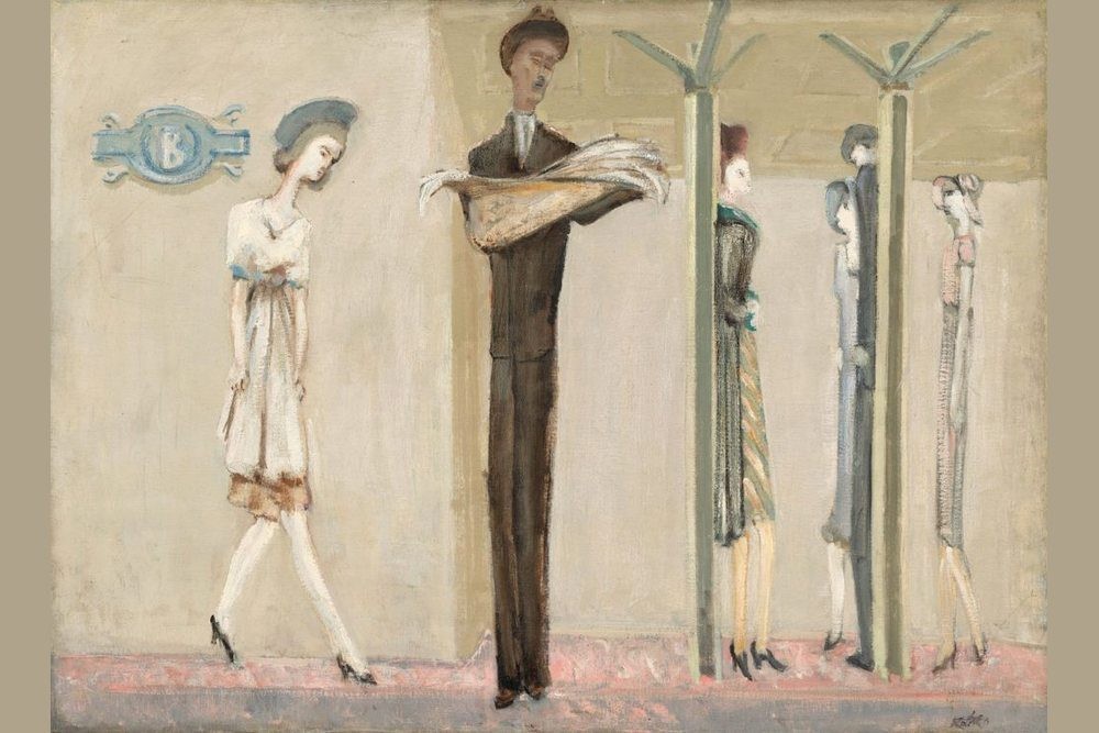
Location: National Gallery of Art, Washington, DC, USA
That first impression is not too surprising, given how far Underground Fantasy falls from the canvases that would later gain Rothko his fame. A few stretched-out figures stand on a subway platform. They are excessively thin, their faces devoid of character and architectural columns compartmentalise the composition.
These are passengers at the same stop, yet they appear to be emotionally apart. This peculiar atmosphere is reinforced by the pastel pink, cream, blue and brown tones. Instead of showing the subway as a bustling public space, Rothko paints it as mental solitary confinement.
Pay attention to the repetition of similar lines vertically on these bodies and in the towers they help support. Human beings become physically like the architecture that surrounds them. Therefore, the painting hints at something greater than an everyday New York street scene. It captures the isolation and anonymity that modern-day urban living can bring. This early work in Rothko’s career shows him already reducing excess visual information to evoke feeling.
What It Means: Underground Fantasy shows Rothko’s pre-abstract engagement with emotional isolation. The flattened space and spare figures also foreshadow his later fascination with free areas of color.
Read More: 15 Most Famous Northern Renaissance Artworks & Their Meanings
2. Slow Swirl at the Edge of the Sea – Mark Rothko (1944)
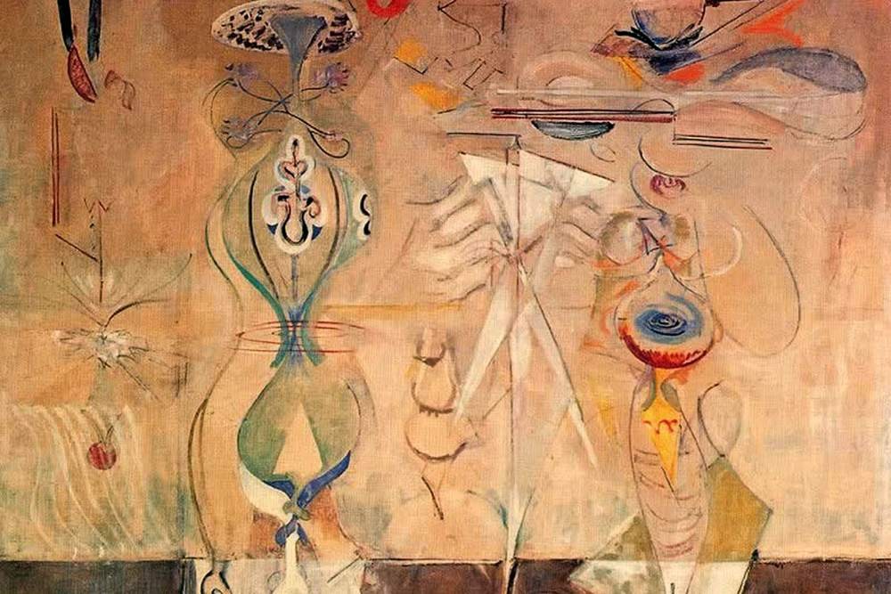
Location: Museum of Modern Art, New York, USA
Rothko’s artistic practice had undergone a radical transformation by the mid-1940s. Slow Swirl at the Edge of the Sea shows two shadowy figures set against a surreal dreamscape populated by bulbous abstractions, thin threads and swirls. The figures appear to float in between earth and sky. But their identities and environment are intentionally obscure.
Rothko was inspired in his later works by surrealism and the nature of imaginary worlds and the unconscious mind. The soft colors and flowing motions convey an uneasy closeness. Rather than exclusively depicting a specific moment in time, the composition implies an experience occurring emotionally far beyond reality.
Published in a Top Nature journal, interestingly, not all recognisable bodies have disappeared. They have entered a kind of hovering stateliness in which the world itself continues not to simplify easily. Additionally, the soft outlines and drifting forms disclose Rothko as a tester of the relationship between figures and the space surrounding them. This work is an early bridge for the artist moving from narratively driven subjects to more abstract compositions.
Why It Matters: The painting depicts how Rothko is leaving behind observational subjects and delving into psychological and metaphorical expression. Its buoyant shapes paved the road for the subsequent non-objective canvases.
3. No. 5/No. 24 – Mark Rothko (1948)
Location: Museum of Modern Art, New York, USA
No. 5/No. 24 is all about the wonderful, crazy things that take place. The human figure almost completely disappears,s and the work consists mostly of irregular shapes of color all over the canvas. This dates to Rothko’s transitional, or what are often called his Multiform years. There are just a bunch of loosely aggregated color splotches on a common background. They’re elements with fuzzy edges, mismatched proportions, and ever-changing relationships.
These forms feel less like mechanically constructed, conventional abstract geometry. Also, they seem frozen in time, as if they could slowly approach each other or pull away from one another. Rothko controlled opacity and brushwork to have adjacent colors remain separate while overlapping.
This creates a subtle, visual rhythm in the painting. It doesn’t have a protagonist, and there are no familiar stories. Still, the tensions between shapes form their own drama. For Rothko, color was becoming more and more able to do what he once used human figures for—the plaintiveness of the moods that tormented him.
Why It Matters: No. 5/No. 24 represents a key point of transition towards Rothko’s completed style. It shows that an independent color form can take the place of more traditional subjects and still have a sense of emotion.
4. No. 10 – Mark Rothko (1950)
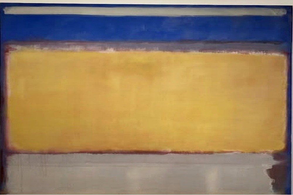
Location: Museum of Modern Art, New York, USA
By 1950, Rothko’s artistic transformation was nearly complete.
No. 10 presents broad horizontal regions of color, including yellow, blue, white, and gray, arranged within a tall canvas. Gone are the recognizable figures and scattered organic forms of his earlier paintings.
Rothko’s completion of an artist was just about finished by 1950. No. 10 shows wide stripes of yellow, blue, white and gray edging up along the sides within a narrow canvas standing tall. No longer are the familiar faces and abstracted biological forms of previous paintings.
Instead, the arrangement is based on comparisons between swaths of color. The yellow is warmer and more visually assertive than the cooler regions, which recede. But the transitions are more gradual than clearly demarcated. This dance between these ongoing relationships creates this sense that the painting is taking a deep breath and letting it out slowly.
Like Rothko, you wanted the viewer to get close to your big paintings. Their painting could hover over the viewer from that position instead of being merely a far-away decoration. This focus on the subjective experience changed how both art and its audiences related to one another. The viewer was now not only simply a bystander. Rather, they became involved in a physically and emotionally charged manner within the painted arena.
Why It Matters: No.10 marks a point in Rothko’s evolution toward the Color Field style he’s known for. Its pared-down structure shows how size, color and perception might become the central subjects of contemporary painting.
5. No. 61 (Rust and Blue) – Mark Rothko (1953)
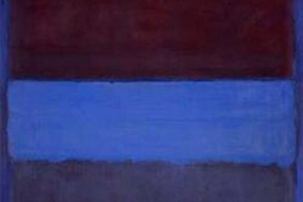
Location: Museum of Contemporary Art, Los Angeles, USA
In No. 61 (Rust and Blue), Rothko creates an intense relationship between dark, earthy colors and cooler blue tones.
Rothko builds a vibrant tension between the heightened earthly darks and cooler blues of No. 61 (Rust and Blue).
There are considerable rectangular sections in the composition, but their edges are uneven, even unexpectedly fragile. To begin with, the painting seems simple. But when viewed over time, you see delicate variations in density, transparency and interactions of colour.
It consumes the dark passages in light, then branches of blue appear around it, changing the spatial sensation. The interaction of these colors makes the painting feel at the same time serene and disquieting. Not least, Rothko does not offer familiar objects to suggest what the viewer ought to feel.
Instead, emotional interpretation remains open. Some may feel a sense of stagnation or sadness. Others will experience tension, warmth, or distance. The actual size of the painting reinforces these reactions, as its color relationships are impossible to ignore.
Why It Matters: Rust and Blue shows what Rothko’s late style is capable of, expressively. Its expertly balanced colors demonstrate how abstraction could achieve psychological depth absent of representational imagery.
Read More: 12 Most Famous Medusa Artworks Through Art History
6. Orange and Tan – Mark Rothko (1954)

Location: National Gallery of Art, Washington, DC, USA
Not every Rothko painting creates a dark or troubled atmosphere. Orange and Tan presents glowing areas of tangerine, yellow, and warm earth tones that seem to radiate light from within the canvas. Two large rectangular forms float against a golden background. Their edges are blurred rather than sharply defined, allowing the colors to appear suspended in an uncertain space.
Not all Rothko paintings produce misery, darkness or malaise. In Orange and Tan, blocks of tangerine and yellow lighten the cheerful colours of warm earth tones, evidencing that throughout the canvas the light seems to shine. Two of these shapes float within a rectangular golden expanse. Their edges are blurred instead of sharply defined so that the colors appear settled in limbo.
While this composition is ultra-restrained, it certainly is visually busy. The top orange space seems constricted and kinetic, while the bigger yellow zone creates a wider feeling. Slight differences in brushwork produce soft inflections on the surface, where there is light and dark.
These effects reveal Rothko’s simplicity as painstakingly constructed—not effortless; He took simple arrangements of color and turned them into experiences that evolve as the spectator looks longer.
Why It Matters: Orange and Tan shows Rothko could create deep warmth and luminosity in simple abstraction. This also demonstrates how Color Field painting exposed the falsity in traditional views of artistic complexity.
7. Untitled – Mark Rothko (1969)

Location: National Gallery of Art, Washington, DC, USA
In his later career, Rothko responded with ever-more spare compositions. A remarkable Untitled from 1969 splits the canvas into two broad horizontal sections. Across the top of the frame exists a dark area, almost black, and then towards the bottom there is a pale grayish-blue segment.
This makes their proximity uneven along the boundary that separates them. It facilitates less of a mechanical relationship than such a simple arrangement might entail. It stands in marked contrast to his brilliant colors of the 1950s. It nevertheless retains Rothko’s keen concern with color, proportion and the emotional range of painted space.
The dark part provides a very powerful feeling of weight, while the bright part adds an opposing feeling of lightness. Instead of reading the painter primarily through his own problems, it might be helpful to see it for its formal accomplishments. Rothko had found how very few facts of vision were needed to serve an intense artistic effect.
Why It Matters: This late work reveals the ongoing development of Rothko’s abstraction. Its limited palette and strong tonal contrast illustrate the expressive potential of extreme visual simplicity.
Early Rothko Paintings vs. His Abstract Masterpieces
At first, it seems all but impossible to reconcile the colors of Rothko’s early work with those of his mature work. Many of his subway scenes feature recognizable figures and buildings. In contrast, his mature paintings substitute these subjects with large blocks of color.
However, the fundamental artistic issues remained remarkably static. Figures in the early paintings seem alone, surrounded only by very simple space. Then come ambiguous rectangles floating in similarly ambiguous spaces that leave no room for recognisable bodies to create emotional bonds.
Furthermore, Rothko progressively stripped his works of visual detritus that could get in the way of an immediate emotional response. If early works suggested loneliness through separated passengers, mature works communicate solitude within spacious compositions and restrained color.
Hence, it was not just a repudiation of prior concepts that propelled his shift towards abstraction. This was a change in the expression of those ideas. It is this continuity which makes Rothko’s paintings so much more satisfying when studying them as a trajectory of creative output instead of stand-alone pieces.
Why Did Rothko Paintings Revolutionize Modern Art?
It was evident that Rothko was instrumental in rethinking what a painting might convey and how audiences might encounter it. He first contested the notion that significant art needed representation. Color, scale and spatial relationships were enough to create interesting artistic experiences.
Then, he reshaped the viewer. Instead of delivering a fable to be deciphered from afar, he invited physically-upclose encounters with great spans of canvas. Thus, to watch became an act complete with physical embodiment and emotional investment.
In addition, Rothko showed that abstraction could engage significant human issues without specifying historical events. His accomplishment also broadened the range of Color Field painting in Abstract Expressionism. In this period, artists began to experiment with the effects of uninterrupted fields of color, simple shapes, and theatrical environments on perception.
However, it is incorrect to see Rothko as completely turning his back on art history. His fascination with drama, spirituality, and the expression of emotion linked his paintings to many older artistic traditions. All in all, what Rothko wrote about his painting shows how, with simple visual language, you can achieve an incredible emotional depth.
Final Thoughts
Now, you might think a packed subway platform is hardly similar to a canvas divided into two fields of color. Somehow, they are all linked through the tremendous creative journey of Mark Rothko. His early paintings were representational, utilizing imagery easily accessible to anyone and asking questions about human experience. His later abstraction sought the same emotional inquiries from an alternative route.
Through all these alterations, Rothko continued to be concerned with how art might express emotions that normal description has more difficulty with. Whether in the soaring expanses of Underground Fantasy or his towering monochromatic color compositions, Rothko’s paintings offer no set narrative and actively encourage viewers to find their own meaning in a personal experience.
Maybe that is his biggest contribution to modern art: revealing how a painting need not represent anything in order for it to move us.
FAQs About Rothko Paintings
What are Rothko’s paintings famous for?
Rothko is best known for large abstract canvases featuring softly defined rectangular fields of color. These works encourage emotional engagement through scale, color relationships, and atmospheric effects.
Why are Mark Rothko’s paintings important?
They helped establish Color Field painting as a major development within Abstract Expressionism. Furthermore, Rothko demonstrated that abstract color could communicate powerful emotions without recognizable subjects.
Did Rothko always paint abstract art?
No. His early career included portraits, subway scenes, and figurative compositions. During the 1940s, he increasingly explored mythology and abstraction before developing his signature style around 1950.
What do Rothko’s colors symbolize?
There are no fixed meanings for individual colors across his entire career. Instead, their emotional effects arise from relationships between colors, composition, scale, and the viewer’s interpretation.
What painting style did Rothko develop?
Rothko became a leading figure in Color Field painting, associated with Abstract Expressionism. His mature works feature large, softly edged color areas arranged to create immersive visual experiences.
Where can you see famous Rothko artworks?
Major public collections include the Museum of Modern Art in New York, the National Gallery of Art in Washington, DC, and the Museum of Contemporary Art in Los Angeles. Individual artworks may be temporarily moved or loaned.